Robotcards: Week 5
2021-04-10
Progress this week
This week I was hit with life/personal family stuff, so I did not get nearly as much done as last week. Actually I am surprised that a week has already passed.
I got two big things done this week tho.
- Changed the way textures are loaded and packed
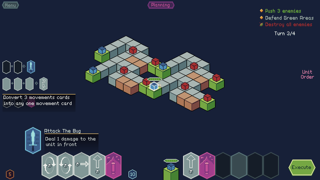
- Made a high fidelity mockup of the ui for the game

Ui Mockup
The mockup really helped me think about how i wanted the UI to look like. The cards cant be too far from the regisers, the hand of crads have to be able to handle at least 10 cards, but should still look good when low on cards.
Also it let me test my color scheme and figure out how many elements I actually need on screen at a time.
One big thing is the card design, i looked at a lot of other card games (physical and digital) and I relaized that for digital games, you can keep the card art at big as you want, since you can give detailed descriptions of what the cards do when you hover on them. Once the player has read that once and used the card they will instantly recognize the card and never read the text again. There is no need for that text to take up ui space all the time.
Using enums for texture loading
One problem that was slowing me down was that every time I would have to show a sprite on screen, I would have to make a new png file, save that in the folder, add it in the list of sprites, add its size, and so on and so on.
I made new Enum based loading system, that lets me load textures much easier and much more reliable. I will make a post about it since I think it might be beneficial for others too.
What is fun?
I really like the ui look and feel.
What is not fun?
The map and units also need some better art
Next week
I think that the next week will focus on:
Implementing the ui mockup i made. Maybe get started on card drag and hover effects